Tuesday, September 21, 2010

Don't just sit there and look pretty


These are the some of the horses I ride for two weeks every year at the H. F. Bar Ranch in Saddlestring, Wyoming.  They spend their winters grazing freely in the Bighorn Mountains. I've been thrown from a horse like this out there and landed in a hospital with a concussion and a lot of bruises and abrasions, faced myself and got back on a horse the next day to ride again.  I've also had to make some tough decisions about riding up steep mountainsides and along narrow cliffs. It's a place to enjoy scenery but also to test your limits and see what you have. Definitely not a place for sitting pretty.

I'm happy to enter the HORSES into smith kaich jones' Sitting Pretty blogcall at Emma Tree.

Thursday, July 29, 2010

Drawing Lab by Carla Sonheim

I've been having so much fun with the drawing lessons in this book.  I'm at the beach this week, and the sunshine and ocean air is really influencing my work.   Here are a few of the things I've done through Chapter 4. (This is my second time doing each lab.) I'll be uploading everything to the Artists of the Roundtable site when I get home.


Well, you know, every girl is pear shaped eventually, right?  And what girl doesn't need two mouths to talk with and eat with?  And two ears to listen to her friends with??


This is my "Miro at the Beach" and it is one my favorite art
pieces I've ever done.  In a drop of water we have my 
entire beach experience - the sand, the grass, the
skies, and the seagulls.  And across it, the movement
of the sun throughout the day. I really love what this 
expresses for me. I'd like to do it again on
canvas. And I used my new, beautiful Byzantia 
paints from artistcellar!


Above is the ink and eyedropper technique, which I 
quickly discovered that I loved.  It felt very
Asian to use ink. Quick strokes seemed to take
on a life of their own as soon as I put them down
onto the paper.  I just watched them almost paint themselves.
It was fascinating and I really enjoyed it.


This one was actually the most difficult for me -- seeing the thing that wasn't really
there.  I had to ask my husband to help me, and he accused me of cheating
on my homework.  It helped me to watch someone else pick out the image
with a pencil, because even when he named the image and pointed at it, I
still could not see it. I don't understand, really, why I couldn't grasp it, but maybe
with practice I can improve on this.


This is meant to be my mom, but she doesn't actually look like this woman
at all. Still, I like the look of the painting, mainly because it's nothing
like anything I'd ever do. I could do an entire American Gothic
family like this, including a dog and cat. As you can see, green and blue
are recurring themes in this work.


Here is another ocean inspired work, with my beautiful Byzantia paints.
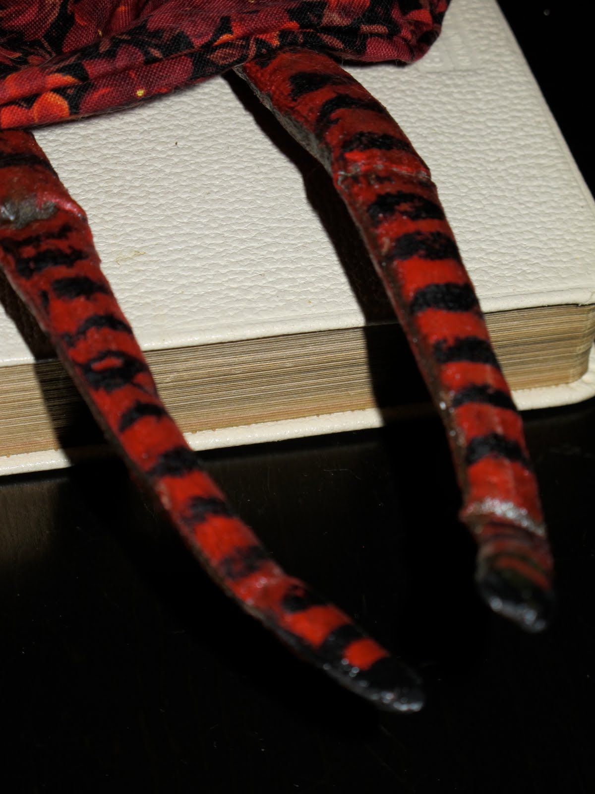
I know this is called Picasso dogs, but my tail is a mermaid's tail, rather
than a dog's tail.  and the human leg has bits of the color of the tail,
as the transformation from human to mermaid begins. The blue and 
sand spray in the background is part of the beach theme.


I did several monkeys before I captured an expression I was happy with. 
I've been into baby faces lately, and this little one was less than a year old when 
his picture was taken.  Isn't he a sweetheart?  Of course, he's green and blue
for the ocean...

Sunday, July 11, 2010

My first cloth and clay doll

Here she is -- my first cloth and clay doll.  I have fallen in love with this medium, and I'm hoping to learn more and more about it.


Her name is Therese and she is an Italian girl from Venice, going to Mardi Gras.


cute little tights and shoes


 her mask


Wednesday, June 30, 2010

Summer Love Journal Prompt

Our journal prompt at Blissfully Art Journaling was to think of a summer love when we were very young.  Here's mine.

Tuesday, June 22, 2010

Painting on the furniture


I can't stop myself from painting everything I see.  I refinished my night tables with pale aqua and yellow paint in a plaid pattern. And I altered some tins for jewelry and they have the place of honor on top of the nightstands.    Those lovely knobs are from Anthropologie, my favorite store.  Starting with the original plain brown, here's the progression...


The new and improved version!


And from the side...

Altered jewelry tin
Another altered jewelry tin
Shells from the Hamptons

Thanks for looking!

Monday, April 26, 2010

The next step - marching across

Here is the next step. And here is a link to Bea's blog, Dog in the Hole Studio which explains that we are supposed to add rectangular pieces marching across. And since i didn't have a clear third color, I added a red line.  Now as I look at all this, I think the whole effect is like an abstract clothes line on a windy day with the papers falling off.    This is a digital work, by the way, and I adjusted the layers to give the effect of those yellow rectangles being behind and in front of the line and the varying sizes.  I really love this piece, but I had no end idea in mind as I was doing it.


Sunday, April 25, 2010

Bea's Abstract Art Project

I'm following along with Bea at Dog in the Hole Studio in her Abstract Art project.  Here we have unity, rhythm, contrast and repetition.